Dental Studio
Gentle dental care, close to home.
Visit live site (opens in a new tab)- Concept build, placeholder clinic
- 2026
- Next.js 16 · React 19 · TypeScript · Tailwind v4 · GSAP
- Hero + 8 sections · ~1,800 lines
Beautiful, but not a dentist.
The first version looked premium and polished. It also looked like a skincare brand. A patient has to know in one glance that this is a real clinic with a real dentist.
“This looks like a proper dental clinic. The doctor seems approachable. I understand what they treat, and I know how to book a visit.”
Version one followed an Awwwards-style brief: ivory and forest green, an interactive smile illustration, a horizontal treatment explorer. The redesign brief called it out plainly: it felt like a luxury wellness or cosmetic studio, not a dental practice.
The audience is a small, independent clinic in India and its patients: families, working people, parents with children, and people who are nervous about the dentist. They need to see the dentist, understand the treatments and reach the clinic fast.
- One small local clinic
- Call, WhatsApp or book
- Credibility before decoration
Clinical credibility first.
Keep the craft, change the signal. Polish comes from type, spacing and quiet motion; every section has to be useful to a patient.
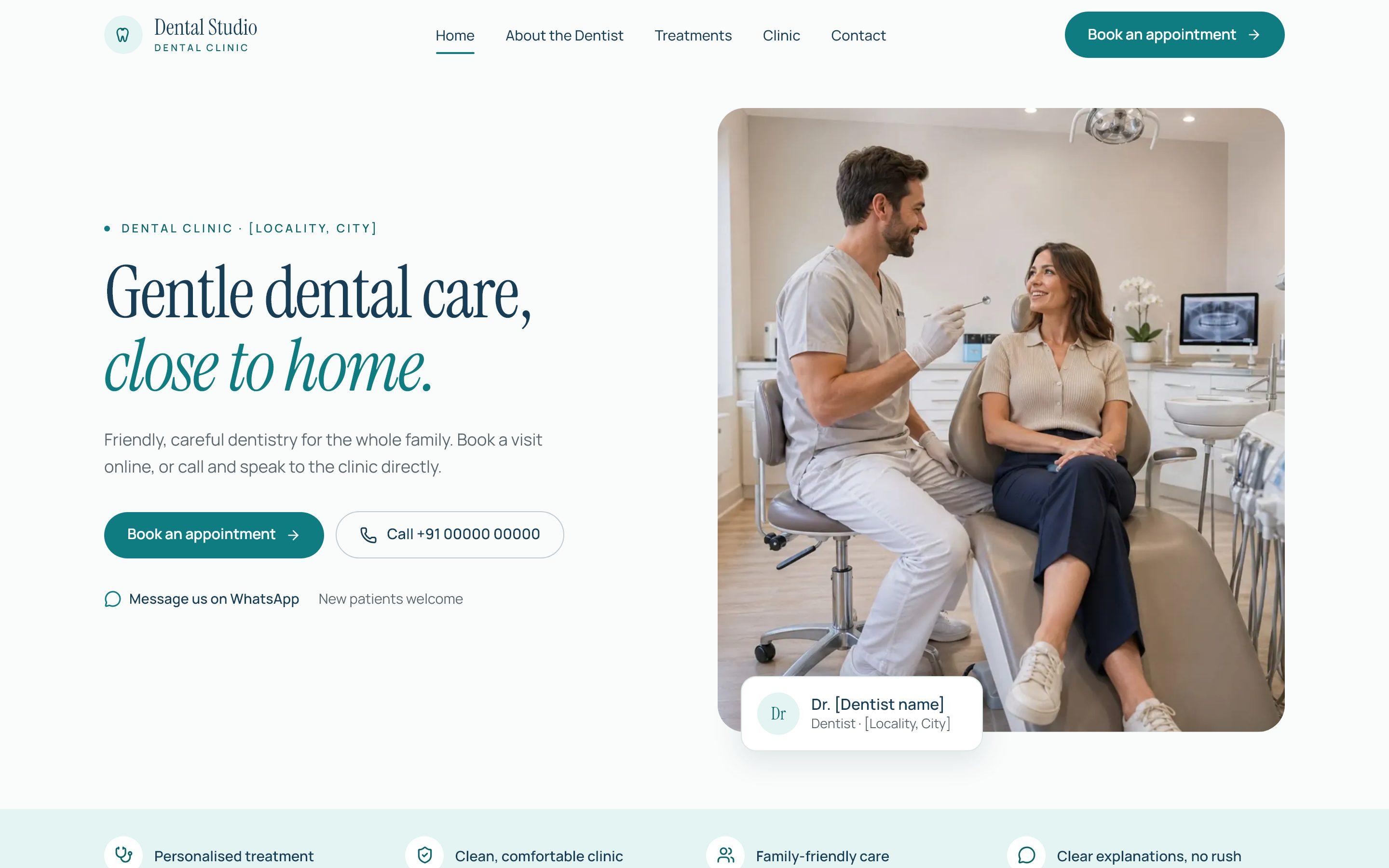
What changed from version one
Palette
Ivory and forest green became a bright clinical set: warm white, aqua, mint, navy and teal.
Hero
An abstract cinematic opener became a split hero with the dentist and three ways to get in touch.
Sections
Smile in Detail, Approach and abstract treatment art were retired. A trust strip, treatment index, Meet the Dentist, Inside the Clinic and the visit journey came in.
People
Fictional doctors and invented quotes were removed. One placeholder dentist stands in until the clinic supplies the real one.
Design language
Instrument Serif for headlines and Manrope for everything else, on a paper-white surface with aqua and mint sections, navy text and a teal accent. Treatments are written the way a patient would ask about them, not the way a textbook names them.
One file holds the clinic.
Content lives in typed data, and every real-world fact sits in a single file marked as placeholder, so handing the site to a real clinic is a data edit, not a redesign.
Layers
Clinic facts
Name, dentist, phone, WhatsApp link, address and hours in one object, every value bracketed as a placeholder until verified.
Content
Treatments, section copy, images and site metadata as typed TypeScript.
Sections
One component per section: trust strip, treatment index, dentist, clinic gallery, visit journey, reviews, FAQ, appointment and contact.
Booking
The form calls a single function. Today it only waits; going live means replacing that one body with a real request.
// DEMO ONLY: nothing is sent anywhere. To go live, replace the body with a POST
// to the clinic's real endpoint and throw on a non-OK response.
export async function submitAppointment(request: AppointmentRequest): Promise<void> {
  void request;
  await new Promise((resolve) => setTimeout(resolve, 900));
}
Reviews only if they're real
The reviews section renders nothing while its list is empty. The brief forbids invented testimonials, so the slot exists and stays hidden until the clinic has real, permitted ones.
Built for a nervous first visit.
Every section answers a question a patient actually has: what do you treat, who is the dentist, what's the clinic like, what happens when I come in, and how do I book.
On the page
Nine treatments
From check-ups and cleaning to root canals, braces and children's care, each in one plain sentence with an 'Ask about this' action.
The visit in five steps
Book, visit, discuss, examination and plan, continue care, with a note that feeling nervous is common and the team will go at your pace.
FAQ
Seven questions people ask before booking, with anything the clinic must confirm shown in brackets.
Contact
Call, WhatsApp, address with a maps link, hours, and the booking form in one section.
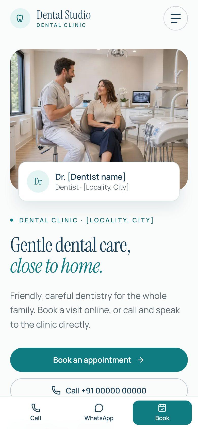
A form that respects the patient
Name, phone, preferred date and time, and reason for visit. Phone numbers are checked against the Indian mobile format, errors are tied to their fields for screen readers, and the button shows sending, success and retry states. The form asks people not to share medical details, and says plainly that it's a demonstration.
Small fixes that matter.
Most of the engineering is restraint. These are the details recorded in the code and the redesign commit.
The intro couldn't drag
On a slow phone GSAP stretches a timeline to catch up. Lag smoothing is turned off so the hero reveal follows the wall clock and never delays the content.
Reduced motion hides nothing
Under prefers-reduced-motion no timeline is created, and the CSS never hides content in the first place.
Teal passes contrast
The teal was darkened so white text on teal buttons meets WCAG AA.
Indian numbers
The phone check accepts +91, 0 or no prefix, spaces and dashes, and requires a 10-digit mobile starting 6–9.
An accessible menu
The mobile menu traps focus, closes on Escape and locks page scroll while open.
Ready for a real clinic's details.
A complete clinic site that reads as a dentist at first glance, with every fact in one file and every placeholder labelled.
Open items
Real details
Name, dentist and qualifications, phone, address and hours all wait on the clinic. Nothing is invented.
Real photography
The photographs are placeholders; the brief puts real clinic and dentist photos at the centre of trust.
Booking delivery
The form validates but sends nothing. It needs a route handler that emails or texts the clinic.
Measurement
No tests and no performance run yet. Lab and field Core Web Vitals are the next step.